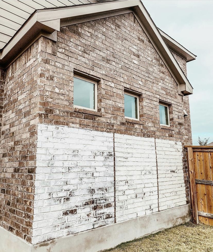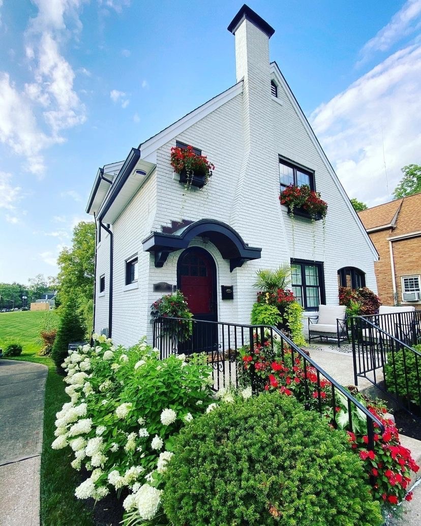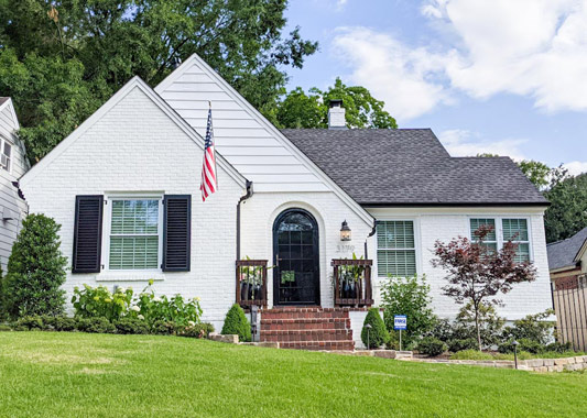
Whites are the easiest color to decorate with and start from scratch, but the hardest to choose. Still, white paint is here to stay.
I have to admit I have been on my Instagram for years scrolling through photos and falling in love with all of the homes freshly painted in white. I just couldn’t wait to paint my home and get that same perfect finish.
Believe it or not, even though we own a paint company, we hadn’t painted the inside of our home in almost ten years! I wanted so badly to just paint and be done, but we didn’t.
It’s a big decision – investing both time and money to repaint the whole inside of your home – and we get that
When the timing was finally right for us, we tackled the painting of our home, both inside and outside, at the same time! I couldn’t believe it. I just had to choose a shade of white and be done.
But the closer I got to decision time to repaint my home, I started changing my mind and lusting after color. I actually LOVE color. I was seeing all the dreamy new trends with darker color accent walls and thought, what if we paint it white and then I like a new trend next year?
I know people have been in their homes for a long time now due to the pandemic, and white might start to be too clean or sterile looking. What if my home becomes outdated again, and I have to wait another ten years before I can repaint?
Lucky for me I have had some training when it comes to color. I am a True Color Expert and trained with Maria Killiam, so I understand what my home needed before I decided to have it painted. Not everyone has color theory training, and I realize that, but something I learned in my training is that white looks best when it has a lot of natural light in the room. If the room is too dark and the walls are painted white, they can look dirty and dingy.
TIP: White walls on the inside look best with lots of natural light.
Now, I knew painting it white was the right choice.
Let me explain why. When I say “white hues” it is because there is a range of color – actual tint added to a base – that creates undertones within them.
The range includes – Blue Whites / Pure White / Off Whites / Cream or Yellow Whites.
It’s a spectrum and you start at blue and work your way into neutral and then yellow (from cool to warm).
People don’t realize that most whites have some color in them and unless you are dealing with the purest white you will need to work with the undertones.
I want to help you choose a white that works for your home – especially if you have to match something. If you are starting from scratch, doing a new build, and can pick everything from the start, then it’s much easier to make sure everything works and stays in the same color tone.
Most people are repainting their homes – inside or outside and need to match something that is already in existence.
So how did I pick the perfect white?
I started with the key thing that was NOT changing in every room, and for me, it was my hardwood floors. They are yellow and orange toned hardwoods. Very California cool and I really like the light tone of them, even though that has not been the new trend lately. And that’s OK. We don’t have to always go with trends.
They lend themselves to an airy, light environment.
They have a lot of orange in them so that means I had to stay away from any blue whites like Romabio Galleria White or Benjamin Moore White Diamond.
I also knew that a bright white would be too much in terms of the floors and my kitchen countertops which had dark greys, yellows, and taupe in them – that old 90s standard granite – so a bright white would look horrible.
TIP: Start with what is not changing on the inside or outside of your home so you can match to it.
The interior in my living room, kitchen, hallways, and upstairs hallway all connects together so I had to choose one color.
I also have amazing natural light.
I knew the perfect white would be the best backdrop to create an open and airy home and be timeless. I used the colors I love for the other rooms that aren’t connected to the main open concept area.
TIP: White is timeless. You can decorate around it for different trends to come.
Since I ruled out pure white and blue whites, then I was only in the off whites and warm whites categories.
TIP: It’s always easier to narrow down to a couple choices and then use samples to make sure it works.
For off whites, there’s Romabio Avorio White, or Benjamin Moore White Dove which is similar, and also sort of neutral. Both are so many people’s go-to whites because they’re neutral whites that can work with cool and warm tones, and will tie elements together.
They’re creamy and lovely and still look very white.
TIP: For the outside of your home, I highly recommend Avorio White in a lot of situations.

This post explains how to choose when using Classico Limewash and you can see that it is never the brick color you want to consider, but the other elements like your roof or trim that will help you decide.
For creams, I was looking at some Benjamin Moore colors like Ivory White. I thought I needed something that had some yellow in it so it could tie the floors and countertops and make it all work.
I was also picking my kitchen cabinet color at the same time and I needed it to work with it. I’ll write more on that color later, but I picked a fantastic blue.
For the Romabio color palettes in the cream category, we offer Riposo Beige and Toscana Beige.
TIP: To sample colors on the inside, I recommend you paint on a piece of poster board, and then use it to position around the room to see if the color works.
The best way to see what it looks like is to use a pure white in the background, not whatever color is on your wall. That previously painted color can affect your sample more than you think so be careful when you paint your sample directly on the wall.
You still should test everything on the wall, and the whites we were debating on looked different at different spots. I have to admit it was confusing.
I really had to put another blank (pure white) piece of poster board behind the painted sample and prop up near the hardwood floor to really see which white was working.
And at first, none of our samples worked. They had too much yellow!
Frustrating.
I went back to my color deck to see what I was missing. There had to be a better white. I could ask the tint experts to tweak with the color formula, but I knew that was challenging. It’s just easier to stay with a common color so you can repaint it or color match from it later.
Then in an old brochure (not even in my color deck) I saw this white by Benjamin Moore called “Cloud Clover”. It seemed perfect.
It was an off white, but almost cream. I think it had just enough yellow in it to work but it wasn’t too creamy or gray.
I sampled it on the poster board and directly on the wall and it was working!
I won. Or at least that’s how I felt. I finally picked the perfect white for my home.
TIP: I’m not going to recommend that you must use the same white that I did in your home, as it depends on what you are matching on the inside or outside.
What I am going to do is help you understand Romabio’s white hues and where they fall on the spectrum.
Once you understand them, it can be as simple as ruling some of them out and then choosing.
TIP: I highly suggest you do not worry about what others are doing.
You need to paint the color that will work in your home. If you don’t have anything that is cool tones or gray or blue, then don’t use a Blue White. It won’t work.
Here are Romabio’s White Colors
AVORIO WHITE
White Category: Off White
Goes well with: Cool or Warm Tones
Tips for using on the Inside: Use it as a neutral white if you have light or medium tone floors. I would recommend it as a trim color for almost any light and medium tone colors or for creams or yellows.
Tips for using it on the Outside: Most popular white because it works so well on many homes, and even if you have some yellow, beige or other brown type colors this white will work.
Romabio home design bloggers who have used this color include: Holly and Brad Lauritzen of Our Faux Farmhouse.
BIANCO WHITE
White Category: Pure White
Goes well with: Cool Tones
Tips for using it on the Outside: It is our brightest white so if you live in a sunny, bright climate it can look amazing and fresh. It would go well with a grey or black roof and black trim.
Tips for using it on the Inside: It is a good ceiling and trim color. Since it is a Pure White, it would look good with Blues and Greens.
Romabio home design bloggers who have used this color include: Susan Daggett of Kindred Vintage.
RICHMOND WHITE
White Category: Off White
Goes well with: Cool and Warm Tones
Tips for using it on the Outside: It is a classic, beautiful white that looks high-end and stately. It goes well with a grey or black roof and black or light color trim.
Tips for using it on the Inside: It is a good, neutral white if you have grays and blues in your home. Pink and red would pop nicely against it too and it could be used as a trim color.
Romabio home design bloggers who have used this color include: Sherry and John Petersik of Young House Love.
NUBE GRAY
White Category: Off White
Goes well with: Cool Tones and Gray undertones
Tips for using it on the Outside: It is a white with a hint of gray so it works on many homes. It would be beautiful with grey, black roof and black trim.
Tips for using it on the Inside: It is a nice gray that would work well if you have grays and blues in your home. Bright yellow or bright blues would also pop nicely against it.
Romabio home design bloggers who have used this color include: Jennifer and Trent Fancher of Noting Grace.
CRISTALLO WHITE
White Category: Off White?
Goes well with: Warm Tones
Tips for using it on the Outside: It is a white with a hint of yellow undertone so it is an antique white.
Tips for using it on the Inside:
Romabio home design bloggers who have used this color include: Jennifer West of West Out West.
TIP: We have color hashtags set up on Instagram so you can always, easily search our colors on that platform to see real life examples.
Here are the other most common questions we get about our whites.
Are your whites available in all products?
Yes.
Longer answer is to understand our products are different and that some colors (not necessarily whites) are not available in all products. Because Romabio products are mineral based, they tend to come flatter in sheen than acrylic paint, inherent of the mineral ingredients.
Acrylics are made from petroleum-based ingredients so they tend to be shinier like plastic, but the sheen should not change the color. This means you can easily match other paints or finishes when using Romabio products.
What if I want a white that is not in a Romabio color collection?
You can get our products custom tinted at your local independent retailer. These experts can match a standard color if they have a color card or you can bring in the color or white for them to match, the same as other paints.
What whites do you sell online?
We sell pre-tinted colors including our whites for Classico Limewash on Homedepot.com; and we sell pre-tinted colors for Classico Limewash, Masonry Paints, and Interior Paints on Amazon.
What is the best trim color for Avorio White / Richmond White / Bianco White?
You can go in a few directions for trim.
1). Classic look where the trim is a brighter white than the color you are using.
2). Same trim color as paint color for a more modern look or
3). Darker trim than the color you painted.
These days any of the styles goes. It really is what look you like best.
For exteriors, we are seeing a lot of darker trim colors used with whites, particularly on the inside of the window frame.
I love this look. It really allows the windows to fade when it is nighttime and makes the beauty of your painted exterior pop.
To answer what is the best trim color for our most popular whites I’ll give you options for a lighter white and dark colors.
Avorio White – Since it is an Off White, then Bianco White or Chantilly Lace would look great if you want to go whiter and brighter. For a darker version, you could use a color like Celtic Stone which is a dark (almost black) gray or Beaver Brown. For dark trim colors, we recommend using Romabio Satin only. It’ll withstand the elements on the exterior (and interior) if want dark colors as the sun and rain can beat on colors, especially in hot and sunny climates.
Richmond White – Since it is an off white with gray undertones, then Bianco White would look great if you want to go whiter and brighter. For a darker version, you could use a color like Celtic Stone, but you could also do something fun like Misty Eyed, Sage Advice or Instant Chateau. These would be amazing colors for the front door as well. (Same note as above for dark trim colors to use Romabio Satin only.)
Bianco White – It is Romabio’s brightest white so I would recommend using the same white on the trim as you can’t go whiter! But you might want to use a black or gray to make it pop or just use a color on your shutters and paint the trim Bianco White.
This is a great post about shutter color ideas from Lauren at Blesser House.
What other colors do you have besides whites?
Our Classico Color Collection is a great place to see our range of colors for Classico Limewash.
The Masonry Paints and Interior Paints can be tinted to light and medium tone. We recommend with darker tones you use Romabio MicroGrip Primer. You can use any of the Young House Love Colors or Kindred Vintage Colors.
Happy Painting!
Leslie


 Photo Credit: Caldwell House, TN